Free template
Luxury property brochure template
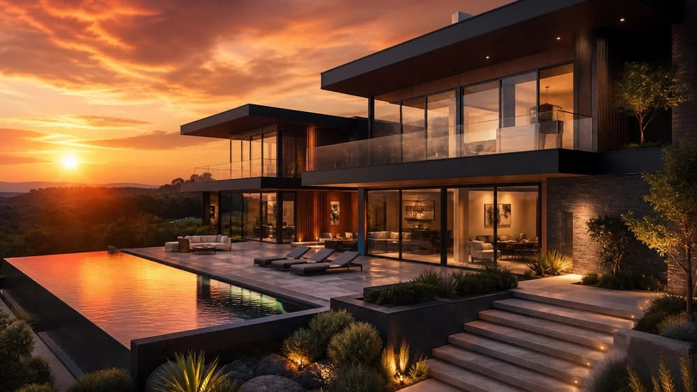
Split cover, generous margins and a slower reading pace. Luxury is for houses where the first impression needs to feel considered rather than hurried.
Best for: Prime residences, country houses, high-value instructions
When to choose Luxury
Use Luxury when the instruction is high-value, the photography is considered, and you can afford more white space than a standard particulars sheet.
Do not use it to “upgrade” an ordinary terrace. Champagne tones on a tired kitchen look like overclaiming.
Suggested page plan
- Split cover: photograph plus address and a short line
- Wider margins and fewer images per page
- A short, slower description
- Selected rooms rather than every cupboard
- Plan and location
- Discreet contact details
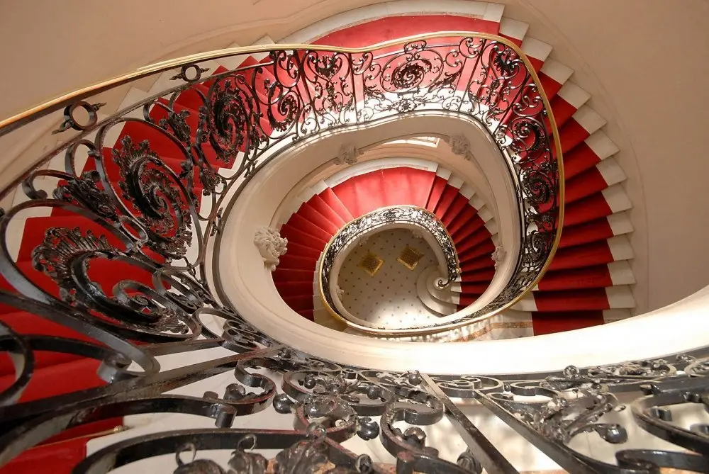
Luxury only works if you edit. Take images out. Write less. Let one staircase or one view occupy a page. If you treat it like a portal dump, it will look expensive and empty at the same time.
Gold and stone colours read as premium in print. They also show dust on a cheap office printer. Check a test page before you leave twenty copies in a sales suite.
See all layouts on the templates hub or compare finished pages in the examples.
Luxury
12 The Avenue
Guildford, Surrey
Guide £875,000